Dybo
Dybo
DYBO is a visual technology platform that reinventing product presentation with automated 3D content generation, photorealistic product visuals and augmented reality. DYBO has worked with companies like OYO Rooms, The Armchair, Giovanni Boutique, MicroD, Russet and counting more.
DYBO is a visual technology platform that reinventing product presentation with automated 3D content generation, photorealistic product visuals and augmented reality. DYBO has worked with companies like OYO Rooms, The Armchair, Giovanni Boutique, MicroD, Russet and counting more.
Challenge
Challenge
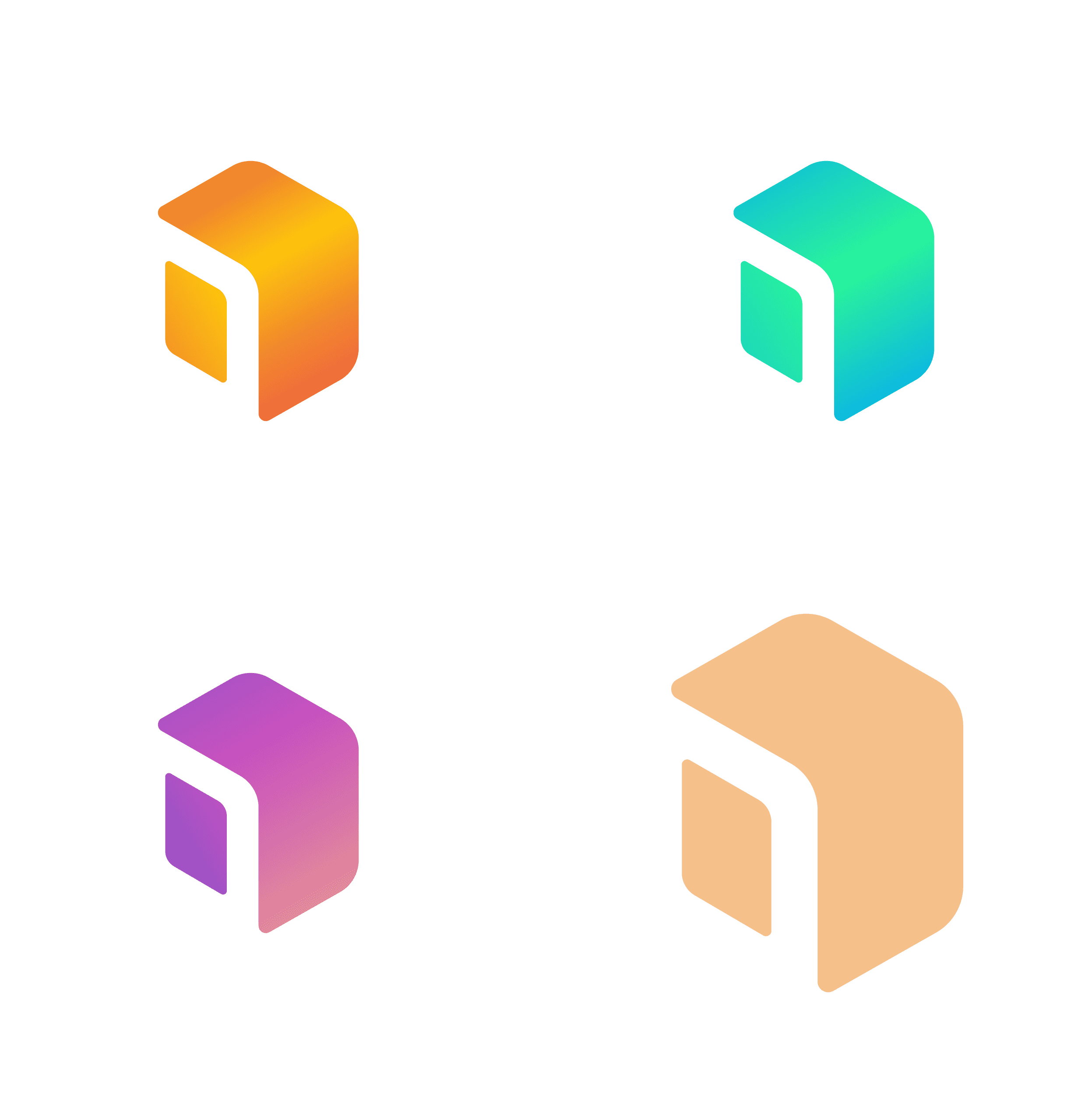
The first challenge in this project was to create a simple, futuristic, and appealing company identity with a 3D element. We looked at a lot of different ideas before settling on this final design, which combines cubical 3d elements to depict a store with a door that also conveys the brand initials D in negative space. The bold square custom font is designed to complement the brand mark.
The first challenge in this project was to create a simple, futuristic, and appealing company identity with a 3D element. We looked at a lot of different ideas before settling on this final design, which combines cubical 3d elements to depict a store with a door that also conveys the brand initials D in negative space. The bold square custom font is designed to complement the brand mark.


The brand
identity
The brand
identity
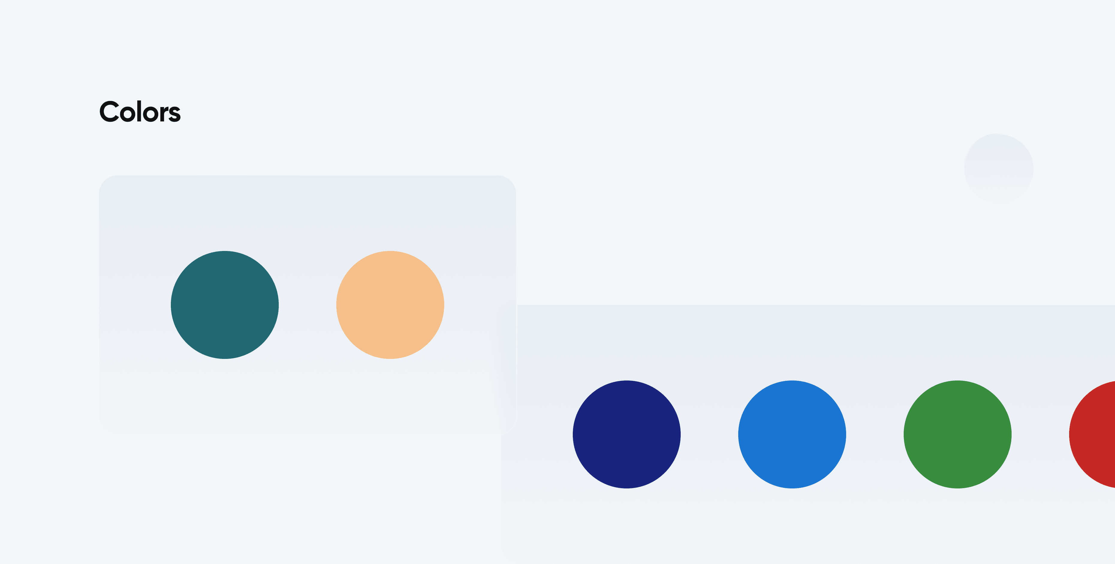
The initial task in this project was to design a brand identity that should be both Minimalistic and inviting, with a 3D element. As a result, we began working on different ideas on paper. Then, experimented with various colour combinations (as shown below) on illustrator, our customer chose the one that best suited their needs.
The initial task in this project was to design a brand identity that should be both Minimalistic and inviting, with a 3D element. As a result, we began working on different ideas on paper. Then, experimented with various colour combinations (as shown below) on illustrator, our customer chose the one that best suited their needs.


Refined UI-UX
Refined UI-UX
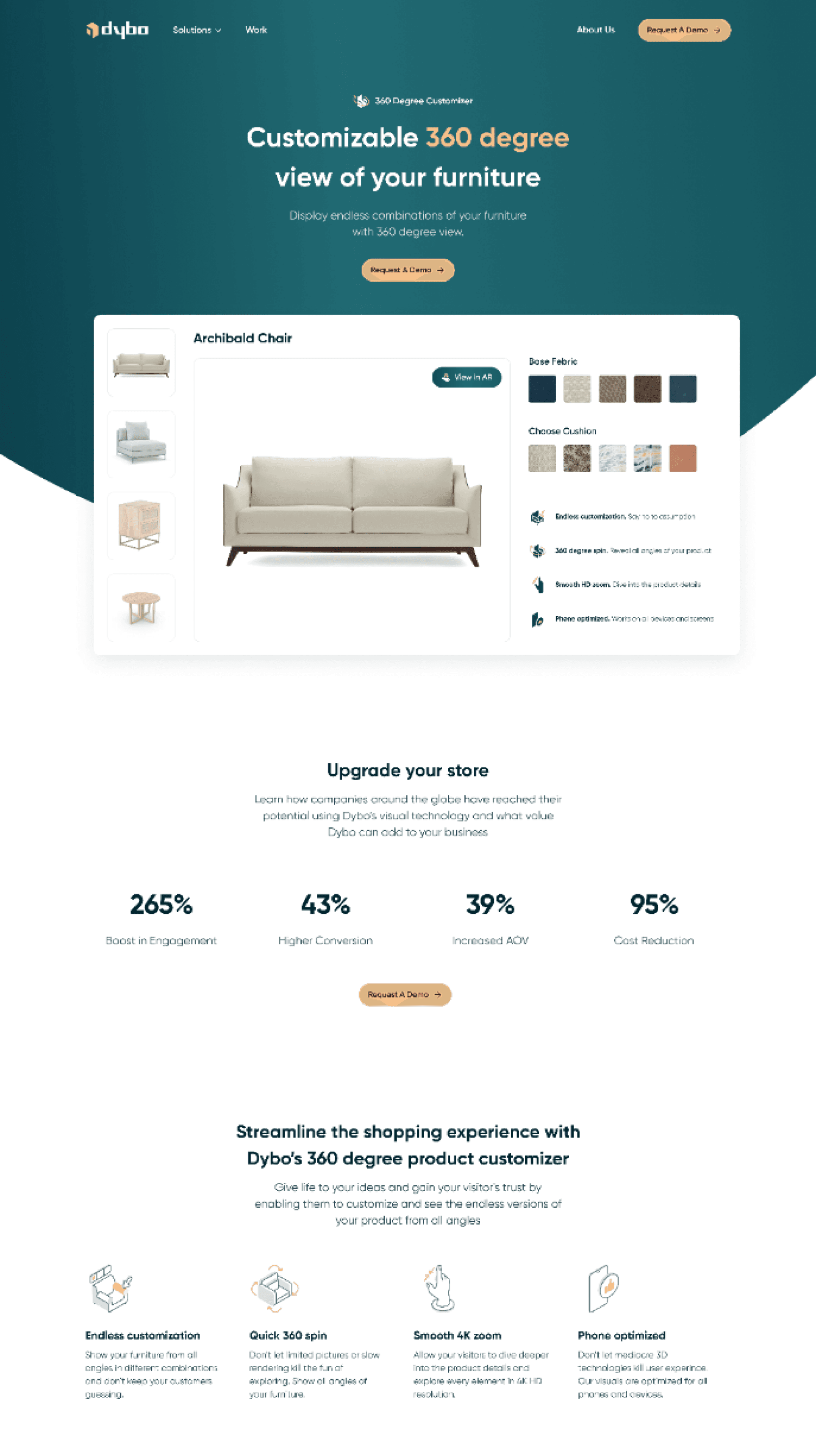
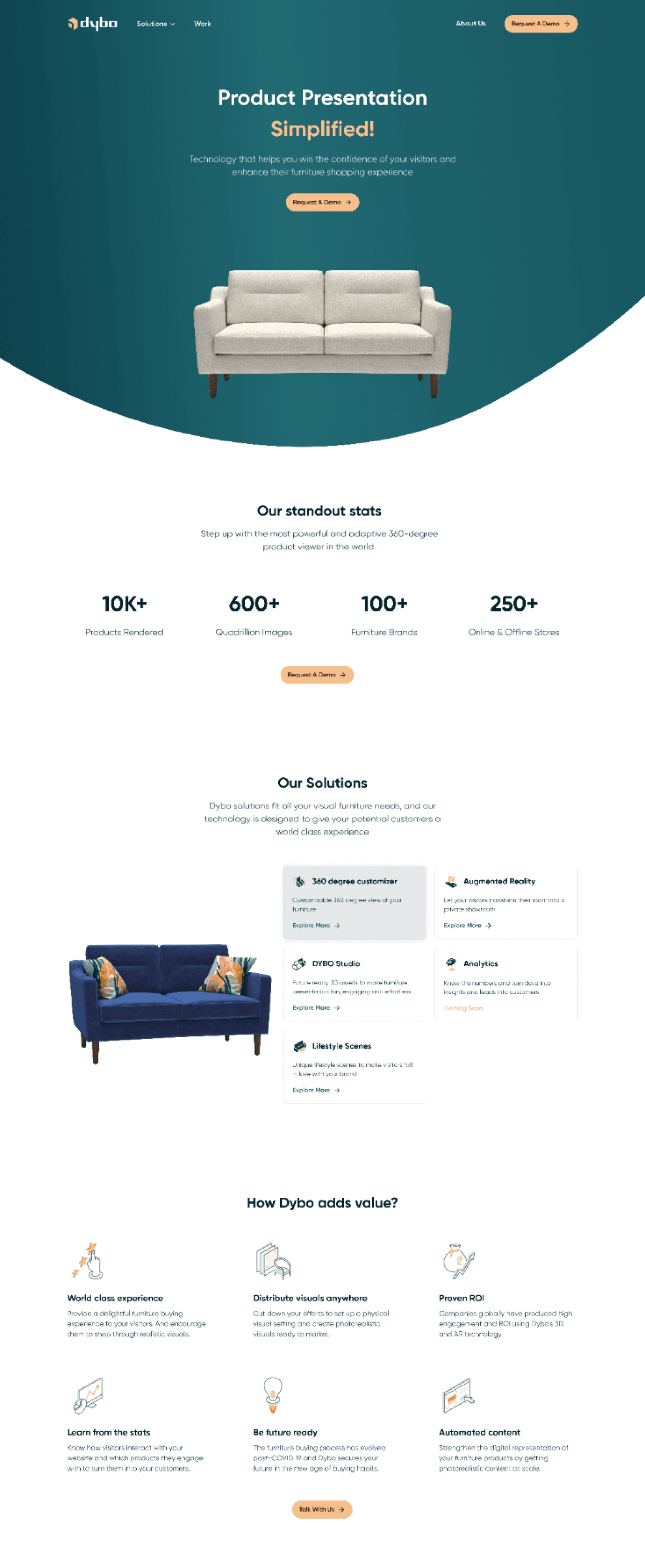
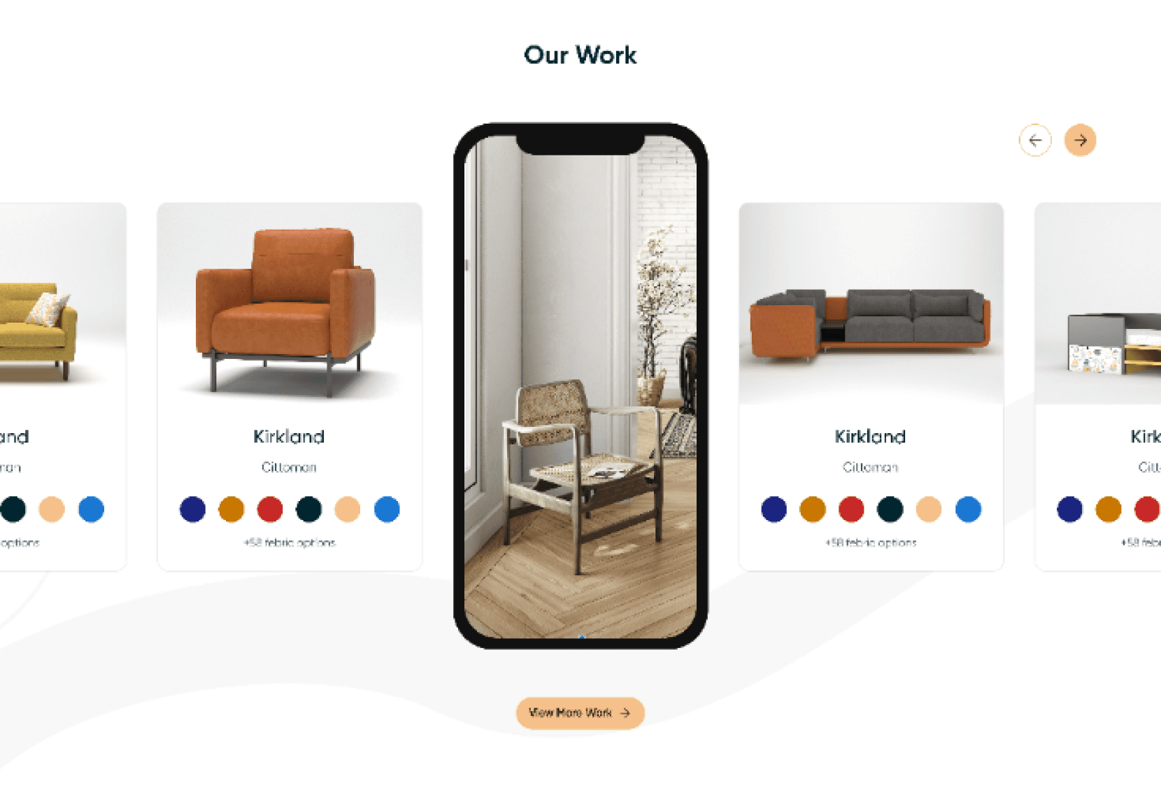
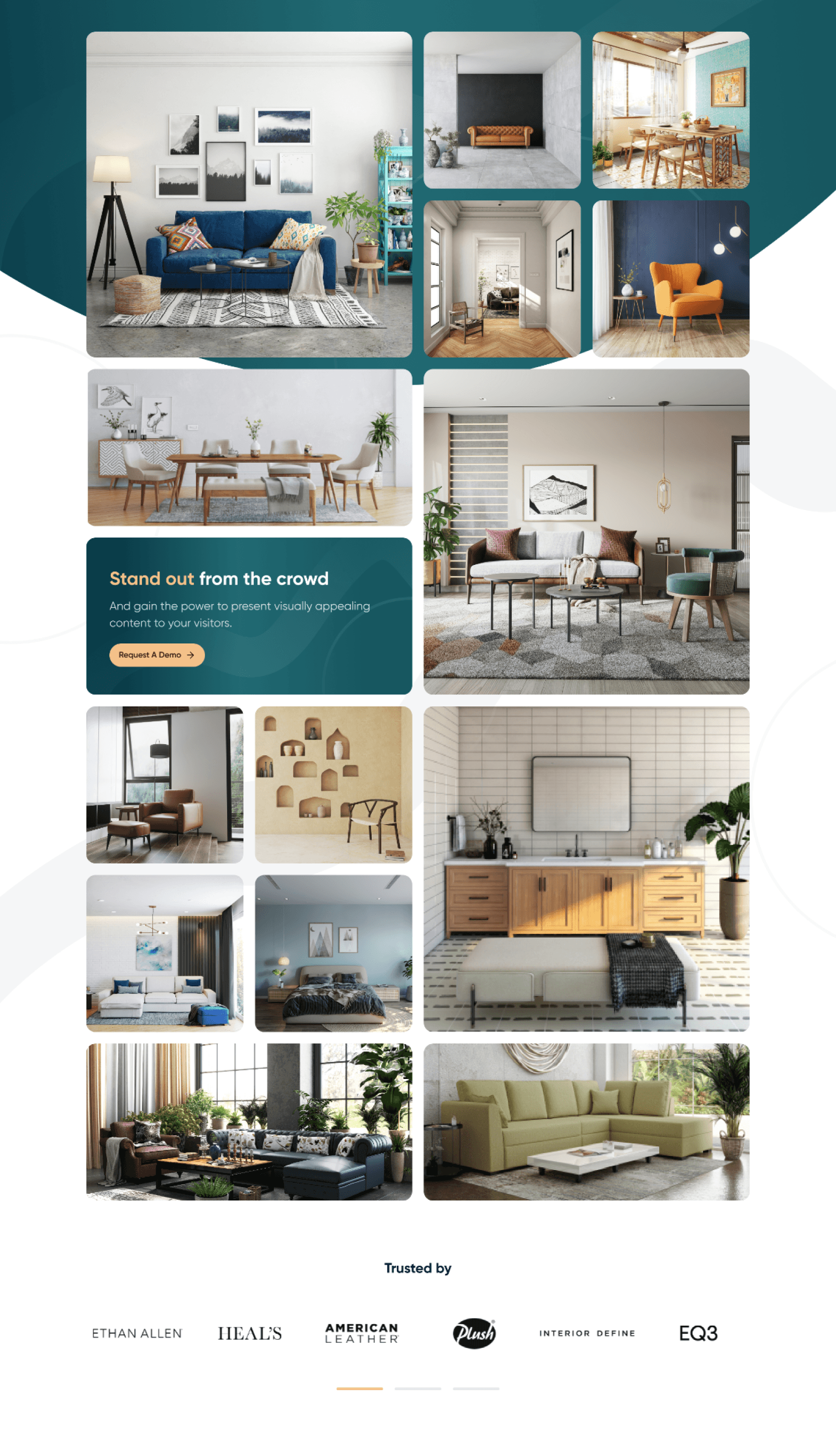
We first sought to create a mood board to visually define the brand and its offerings before diving into the design intricacies. We also took inspiration from other like-minded examples such as Dribble, Behance & other similar gaming platforms.
These pre-existing designs were really helpful in establishing our own visual design language. We were able to gain a deeper understanding of the brand's offerings and features from the perspective of the audience as a whole.
Design
methodology
Design
methodology
Understanding the pain points of the target market and analysing the competition are essential for any product's success. So we began the project with user research to discover the users' pain spots, followed by the creation of user personas to answer their problems in our final product, and the competitive analysis revealed some other surprising data. After gathering all of the information and consulting with the stakeholders, our team created a product journey map with information architecture. We utilised a card sorting technique to evaluate the material on the site before going into the structure and layout.
Understanding the pain points of the target market and analysing the competition are essential for any product's success. So we began the project with user research to discover the users' pain spots, followed by the creation of user personas to answer their problems in our final product, and the competitive analysis revealed some other surprising data. After gathering all of the information and consulting with the stakeholders, our team created a product journey map with information architecture. We utilised a card sorting technique to evaluate the material on the site before going into the structure and layout.
User Research
Competitive analysis
Journey map
Wireframes
Design system
Icon design
UI design
Card sorting
1 Week
2 Week
3 Week
4 Week
Information architecture
Research
& analysis
Research
& analysis
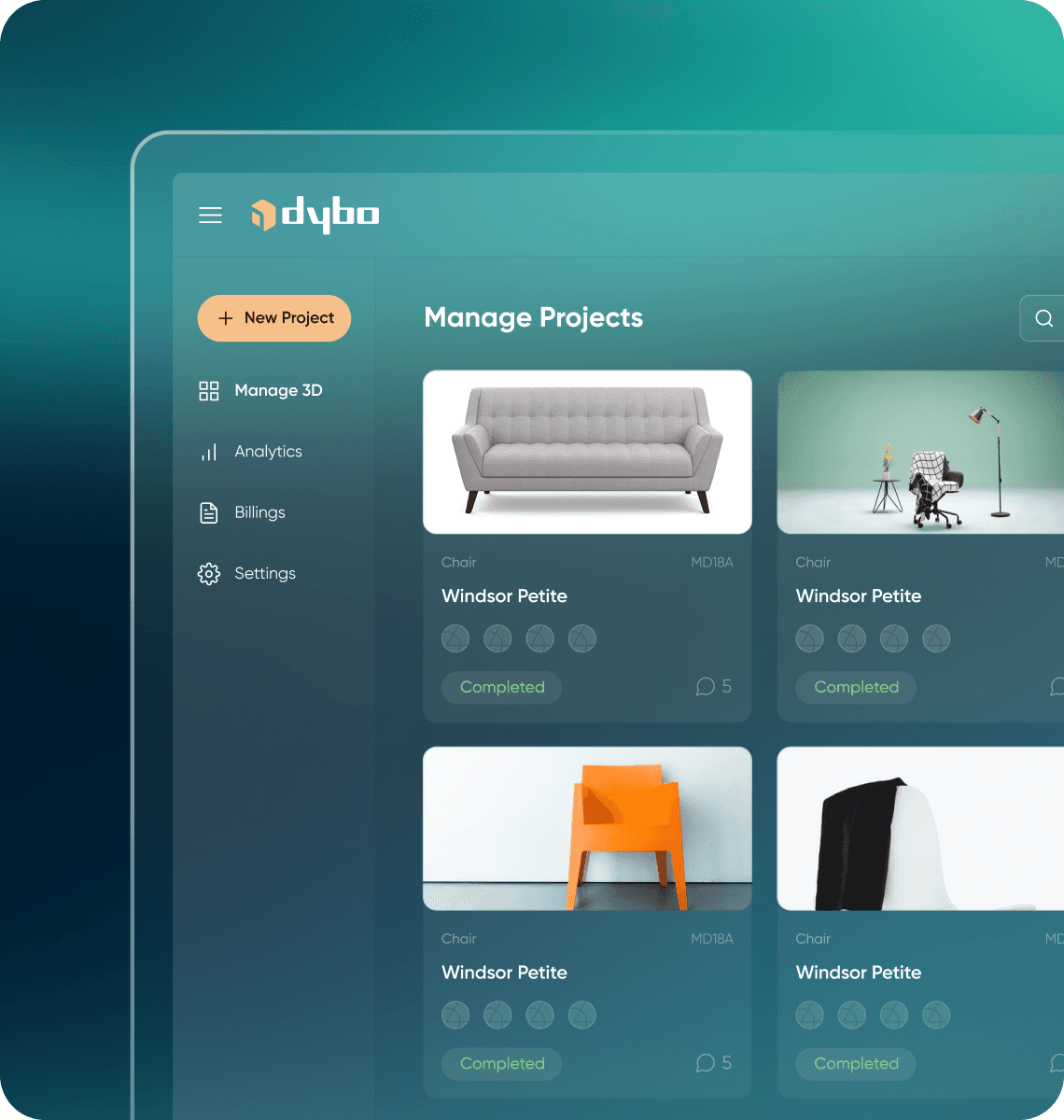
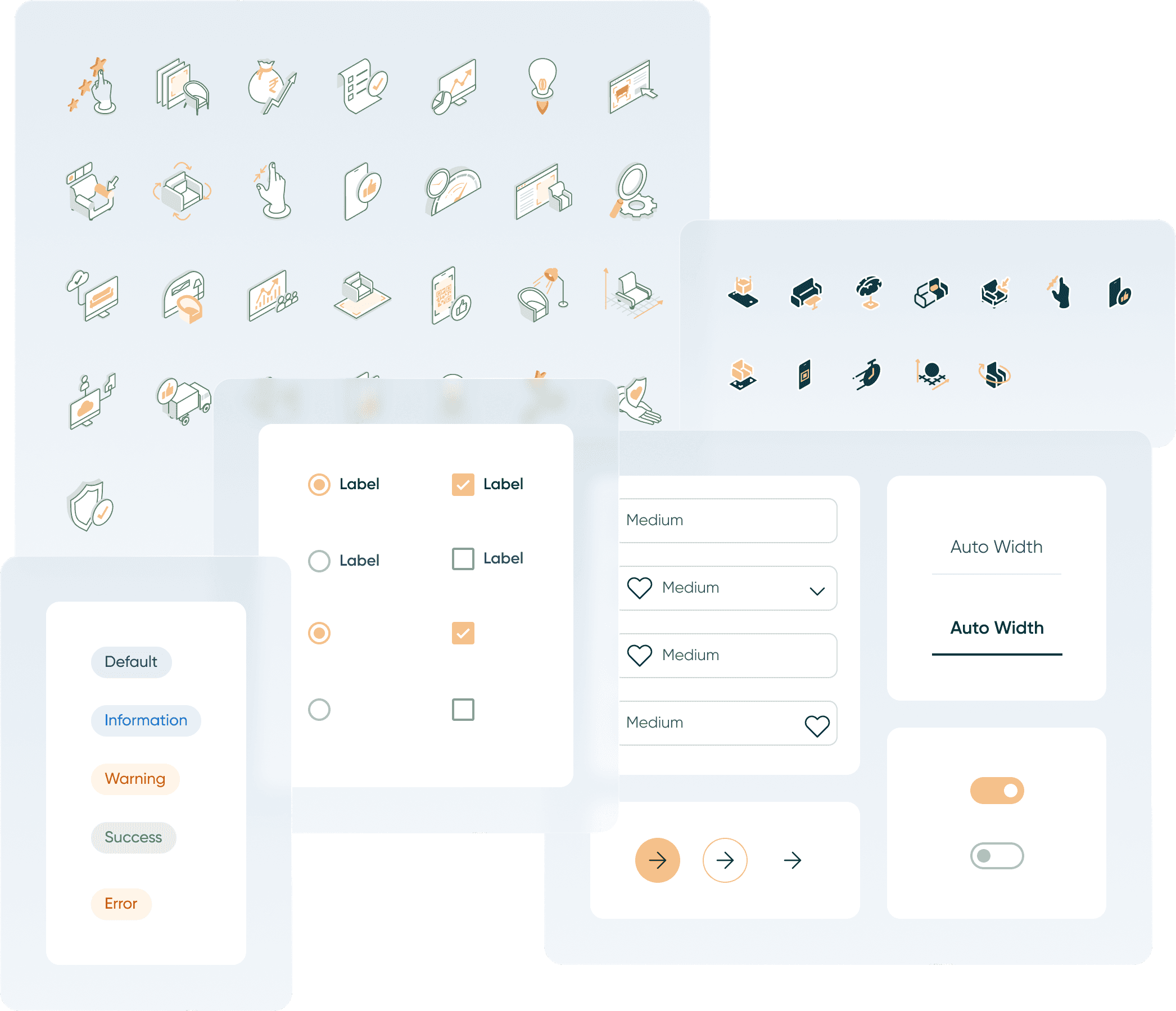
We created wireframes to represent the product's interface with all of the data points after two weeks of research and analysis. While working on the wireframes, our team concentrated on the design system, such as the typography, icons, and colours that will be utilised in the final UI. We tried out a few different options for the product's user interface before landing on the one that best satisfied the user's and clients' needs.
We created wireframes to represent the product's interface with all of the data points after two weeks of research and analysis. While working on the wireframes, our team concentrated on the design system, such as the typography, icons, and colours that will be utilised in the final UI. We tried out a few different options for the product's user interface before landing on the one that best satisfied the user's and clients' needs.

Design system
Design system
To achieve consistency and uniformity in design, we designed a unique design system by leveraging a repetitive collection of components, such as font, forms, input area, buttons, and colours. This allowed us to create a consistent and unified experience across all of the website's pages and dashboard. Because of Gilroy type's current appearance and versatility, we were able to create a clean minimalistic ui with a lot of clarity and usefulness. We utilised Myrtle Green as our major colour scheme, which helped us stand out from the competition, as well as mild tints of the Golden colour.
To achieve consistency and uniformity in design, we designed a unique design system by leveraging a repetitive collection of components, such as font, forms, input area, buttons, and colours. This allowed us to create a consistent and unified experience across all of the website's pages and dashboard. Because of Gilroy type's current appearance and versatility, we were able to create a clean minimalistic ui with a lot of clarity and usefulness. We utilised Myrtle Green as our major colour scheme, which helped us stand out from the competition, as well as mild tints of the Golden colour.
Gilroy
Gilroy
Aa
1
Bb
2
Cc
3
Dd
4
Ee
5
6
Ll
!
Ww
Ff
7
Mm
@
Xx
-
Gg
8
Nn
#
Yy
+
Hh
9
Oo
$
Zz
=
?
Ii
0
Pp
%
Jj
^
Kk
Rr
&
Ss
*
Tt
()
Uu
_
Vv
UI Components
UI Components
100+
Medium
Medium
Medium
Medium
Auto Width
Auto Width
Label
Label
Label
Label
Default
Information
Warning
Success
Error
Client review
Client review
We collaborated with DB Universe for Dybo.io Platform's redesign, and it was a pleasure. Their design boosted our conversion rate and introduced us to a design-focused mindset.

Dhawal Jain
Founder & CEO, Dybo


Have an Idea?
© 2025 DBUStudio
Have
an Idea?
© 2025 DBUStudio